Overview Insights in Applova Analytics
The Overview section helps merchants quickly review overall business performance.
Merchants can use this section to understand total orders, total sales, average ticket size, refunds, sales trends, top-selling products, top-selling categories, payment methods, and collected amounts.
How to Access the Overview Section?
Step 1
Log in to Applova Analytics.
Step 2
Click Overview from the left-side navigation bar.
Step 3
Select the required reporting period from the date filter.
Image Link
Overview Reports
The summary cards at the top of the Overview page provide a quick snapshot of key business metrics for the selected reporting period.
- Total Orders shows the total number of orders received during the selected reporting period. Merchants can use this metric to quickly understand order volume and compare it with the previous period.
- Total Sales shows the total sales amount generated during the selected reporting period. Merchants can use this metric to review overall sales performance and compare it with the previous period.
- Ticket Size shows the average order value for the selected reporting period. Merchants can use this metric to understand how much customers spend on average per order.
- Total Refunds shows the total refunded amount for the selected reporting period. Merchants can use this metric to review refund activity and compare it with the previous period.

The Total Sales By Day of Week chart shows which days of the week generated the most sales.
Merchants can use this chart to understand weekly sales patterns and identify busier days.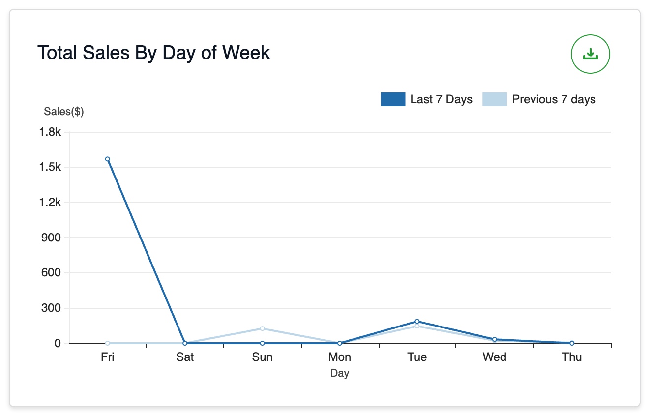
Image Link
The Average Sales By Time of Day chart shows average sales by hour.
Merchants can use this chart to identify peak sales hours and slower business hours.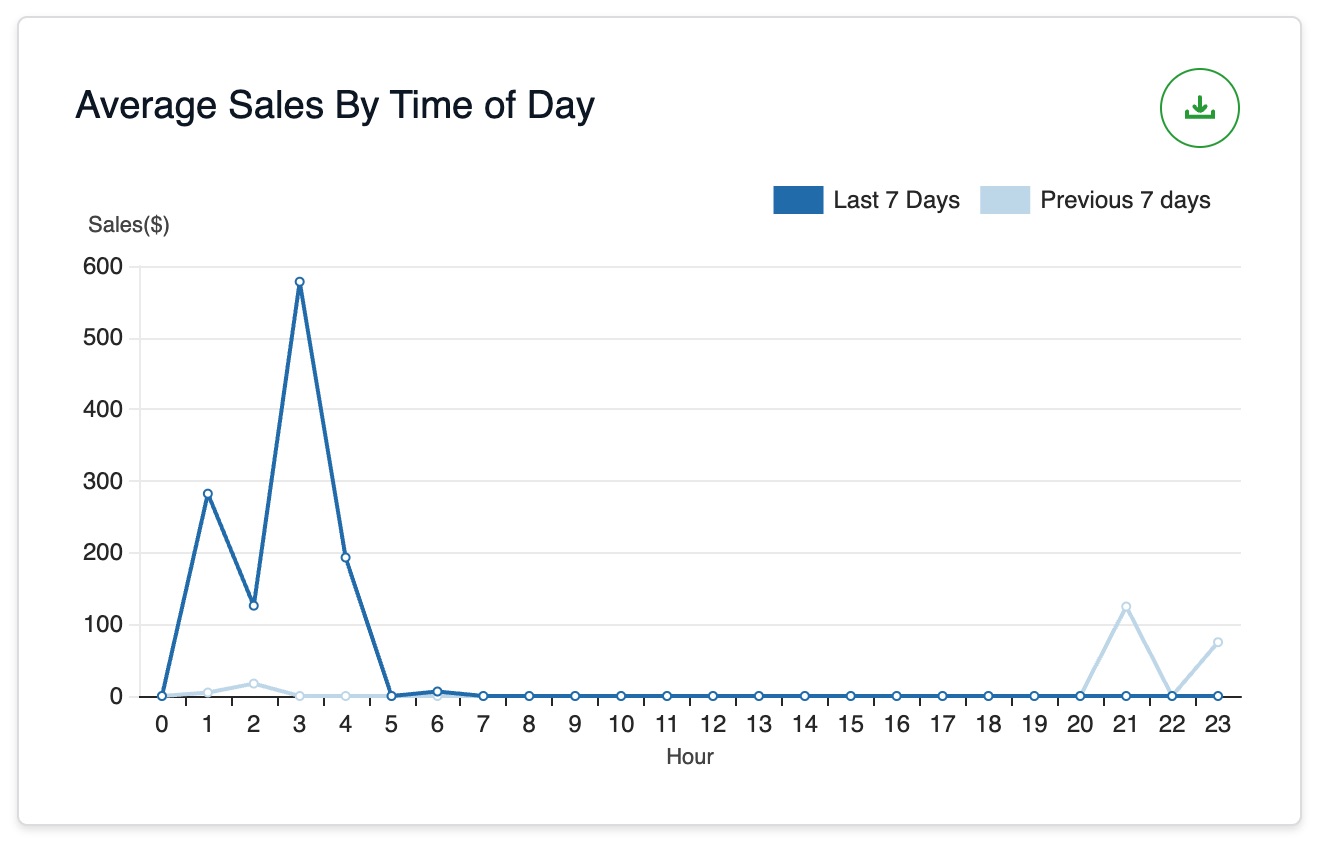
Image Link
The Top Selling Products By Sales chart shows the products that generated the highest sales.
Merchants can use this chart to identify high-performing products and popular menu items.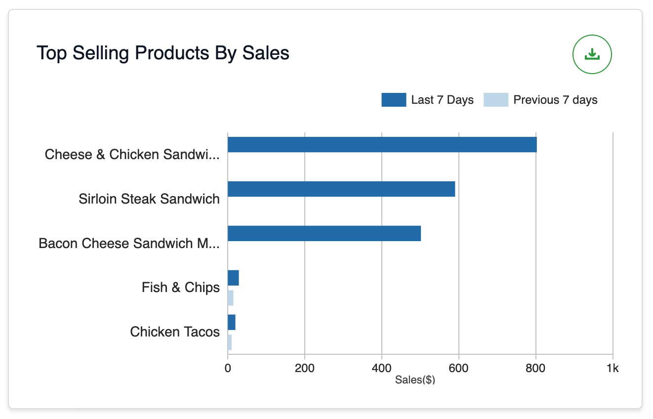
Image Link
The Top Selling Categories By Sales chart shows the product categories that generated the highest sales.
Merchants can use this chart to understand which categories customers purchase most.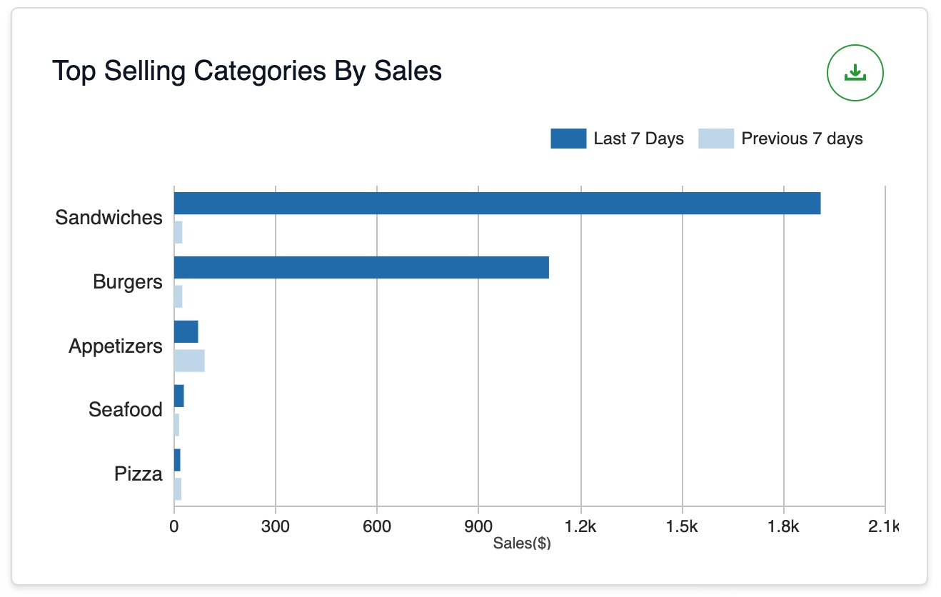
Image Link
The Sales Summary table shows a breakdown of sales amounts.
Merchants can use this table to understand how the final collected amount is calculated.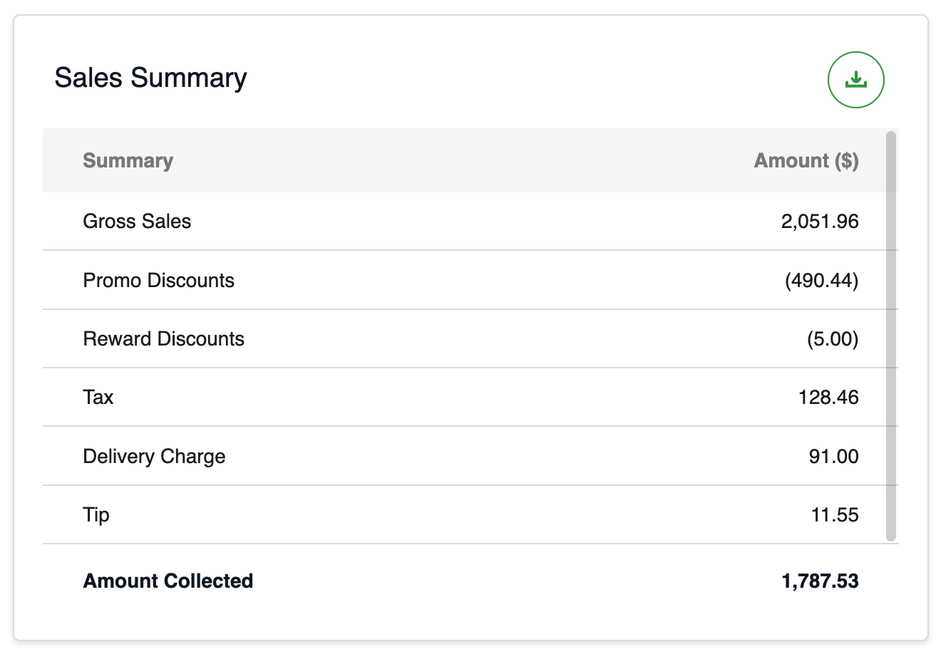
Image Link
The Payment Methods table shows the payment methods used by customers and the amount collected through each method.
Merchants can use this table to review payment activity for the selected reporting period.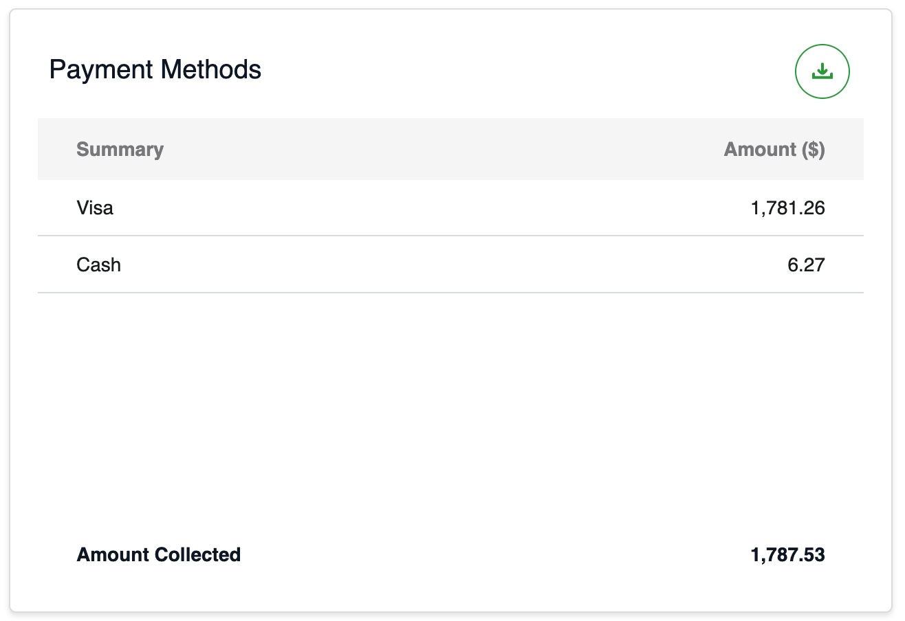
Image Link
Related Articles
Promotion Insights in Applova Analytics
The Promotions section helps merchants review promotion usage and promotional sales. Merchants can use this section to understand how many customers used promotions, how many orders included promotions, which promotions are active, and how much sales ...Product Insights in Applova Analytics
The Products section helps merchants review product and addon performance. Merchants can use this section to identify top-selling products, least-selling products, product sales totals, addon sales, and detailed performance for individual products. ...Customer Insights in Applova Analytics
The Customers section helps merchants review customer activity and engagement. Merchants can use this section to understand new customer signups, new customers served, returning customers, guest users, top customers, and all-time active customer ...Sales Insights in Applova Analytics
The Sales section helps merchants review sales performance in more detail. Merchants can use this section to understand sales trends, sales by channel, product and category performance, tax details, payment methods, and collected amounts. How to ...What is Applova Analytics?
Applova Analytics helps merchants monitor store performance, track sales trends, analyze product and customer activity, review promotion performance, compare results with previous periods, identify top-selling products and categories, and export ...